|
ART ASTRONOMY Uranus
2023 on Sun, Moon, Venus & Miscellaneous PROCESSING
TUTES |
JUPITER 2018 |
|
|
Note: Some of the images on this page are
"clickable" and will open up as "full scale images" in a
new tab. |
||
|
2nd September 2018 |
||
|
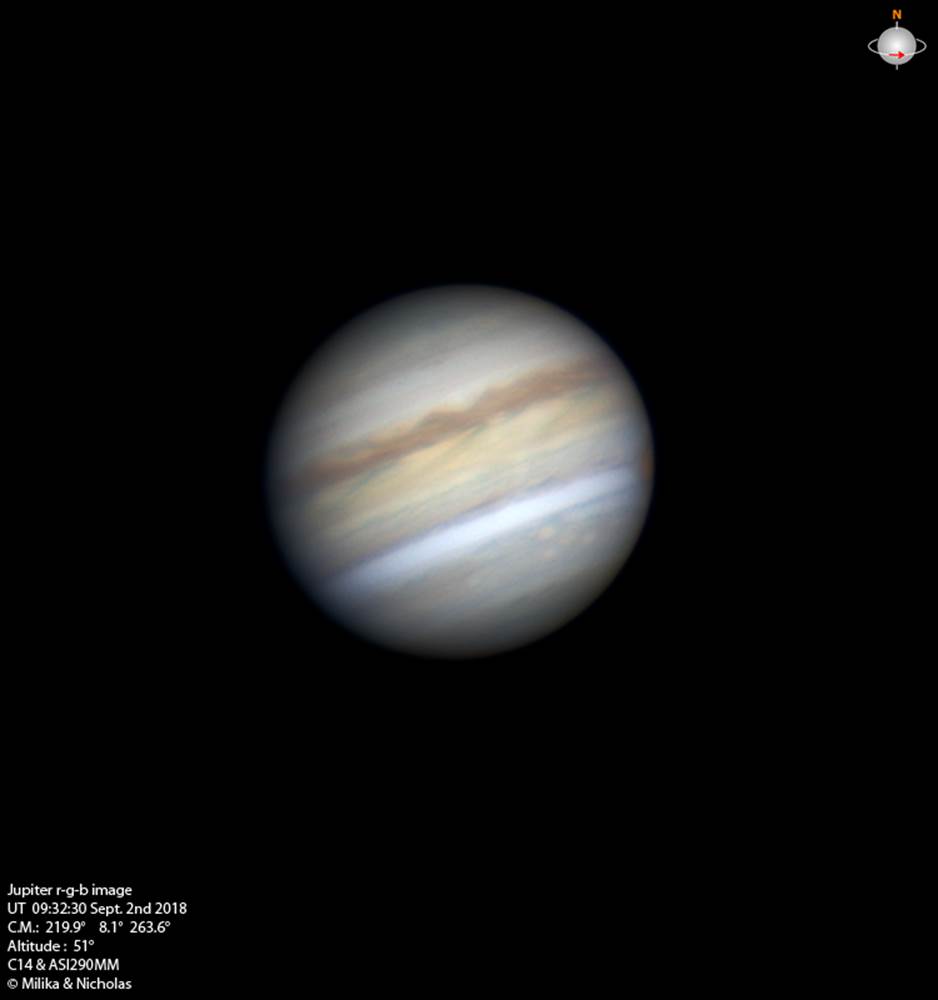
Last Jupiter image for 2018 Any other time I wouldn't show this image but it does have some interesting aspects; the few times we've tried to image Jove just after Sunset any other times recently the seeing was usually absolutely horrific. Most noticeable is the darker EZ has now
taken on a distinct yellowish hue to its colour. |
||
|
|
||
|
|
||
|
10th July 2018 In the 3 images below the darkening of
the EQ Zone (EZ or Equatorial Zone) mentioned 4 images down. (when it first
became visible in our own images) |
||
|
|
||
|
30th June 2018 |
||
|
|
||
|
|
||
|
18th June 2018 In the image below Jupiter first begins
to display a “darkening” of the Equatorial Zone (EZ) the central region of
the disk immediately below the NEB (Northern Equatorial Belt) which is the
(upper) dark reddish-brown belt/band on the planet. |
||
|
|
||
|
9th May 2018 Animations |
||
|
The image below is an animation created from a series of captures taken as Jupiter approached opposition this year: the precise time of opposition in 2018 was UT 01:00 (give or take a few minutes) on May 9th 2018. The last frame of this animation (before it reverses & sequences back to the first frame) was captured 9 hours & 10 minutes before the precise time of opposition. Note that this is an
animation using real frames created as a sequence - as opposed to those
animations that rely upon a “skin” being created in WinJUPOS…the WinJUPOS
types of animations look very convincing, but in my opinion have an inherent
element of artificiality that I prefer to avoid! ;) |
||
|
|
||
|
|
||
|
Recent discussion about types of planetary animations on the Cloudy Nights planetary imaging forum brought up questions on the differences & merits between “traditional” animations (time lapse images arranged in a sequential, animated display) versus those created using a cylindrical projection “map” or “image” with the WinJUPOS software program such as the example above for the WinJUPOS animation here. This WJ software, in simple terms, effectively “wraps” a map we generate from a series of images of the planet we have captured (the more the better) around a simulated globe where the viewing perspective shifts to give us the impression we are looking at a rotating globe of the planet. |
||
|
|
Because it is only one image (albeit being made up of possibly many separate images) this type of animation can appear very impressive, with smooth, uniform detail (because it never changes) & motion that is difficult to emulate in “traditional” animations On the other hand, the “traditional” sequential set of captured images is far more “dynamic” in that it is influenced by the varying seeing that occurs over the time taken to acquire the number of individual images used. It is important to note that the WJ versions still utilise multiple images, but when these are combined to form the “map” that is wrapped around the “virtual globe” the single image created is a smoothed-out single “wrap” that might display differences in different sections (for instance, between the left-hand, middle & right-hand sides of said “wrap/map”) but none of these sections will vary as the virtual globe rotates – in the “traditional” animated sequence the same details will vary as the globe/disk rotates. |
|
|
Once the WinJUPOS .ims files are created (& this is often done for “traditional” animated sequences as well as WJ types) the WJ animations are then created very rapidly, whilst the “traditional” still require a lot of pain-staking application! However, I personally believe the “traditional” animation above the WJ “map” to to be a much more “real” animation because you are actually viewing a genuine rotating disk as opposed to viewing a single rotating image – but I emphasize that this is only a personal opinion. In the example above – more images over a
longer timespan would do this WJ type more justice, & remove the “phase
appearance” at the start of each “rotation” - just as they would in a
different manner for the comparable “traditional” example. |
||
|
8th May 2018 Some detail in the GRS as well as across the disks of this image about 35 minutes apart last night & continuing the much better run of decent seeing we've been lucky enough to encounter more recently |
||
|
|
||
|
5th May 2018 |
||
|
|
||
|
4th May 2018 |
||
|
|
||
|
29th April Ganymede with some albedo variations in the Jovian image below |
||
|
|
||
|
Comparison images displaying the
“turbulence” in the clouds systems before & after the GRS.in the SEB
(Southern Equatorial Belt/Band) between April 29th & May 8th
2018
|
||
|
25th April 2018 |
||
|
|
||
|
2nd April 2018 Jove showed the merits of good atmospheric conditions (transparency could've been a bit better) & delivered one of our best Jovian image so far this apparition, revealing a lot of turbulence in the SEB |
||
|
|
||
|
29th March 2018 |
||
|
|
||
|
|
||
|
|
||
|
|
||
|
20th March 2018 |
||
|
|
||
|
11th & 12th
March 2018 Comparison Whilst
there is more detail in the red channel on the left below...it can be seen
that it is not as "crisp" as that in the image on the right. |
||
|
|
||
|
12th March 2018 What I'd term dirty seeing in many ways due to the disk of Jove in particular appearing as if it was covered in grime...but at the same time quite a wealth of detail on said disk this phenomenon is quite familiar to us. Here's a decent Jovian image in rgb which we were fairly pleased with for so early still |
||
|
|
||
|
11th March A quick integration of the first 3 red channels from the morning before with Io & the GRS...as noted before there's a bit of detail in the GRS, Red Channel and the RGB below it |
||
|
|
||
|
|
||
|
26th February 2018 |
||
|
|
||
|
|
||
|
|
||